Top 10 Design Choices That Make Custom Kitchen Cabinets Look Truly Built In
When a kitchen looks like it was always meant to be there, not added later, you are usually seeing the difference between stock cabinetry and truly integrated, on site tailored craftsmanship. The term people use most is “built in.” In a kitchen, built in does not just mean custom sizes. It means the cabinetry reads as part of the home’s architecture, with intentional alignment to ceilings, walls, windows, and trim. Seams feel planned, not patched. Panels die into walls cleanly. Molding details look continuous, not like an afterthought.
At Masterpiece Millwork and Cabinetry, we build full service cabinetry and architectural millwork, and that combination matters. The most convincing built in kitchens are designed like millwork, not like a collection of boxes. They depend on a set of design choices made early, then executed precisely during fabrication and installation.
This article lays out the top 10 design choices that make custom kitchen cabinets look truly built in. Each point includes what the choice is, why it works, and what to ask your cabinet maker, designer, or installer so the finished kitchen looks seamless, intentional, and high end for decades.
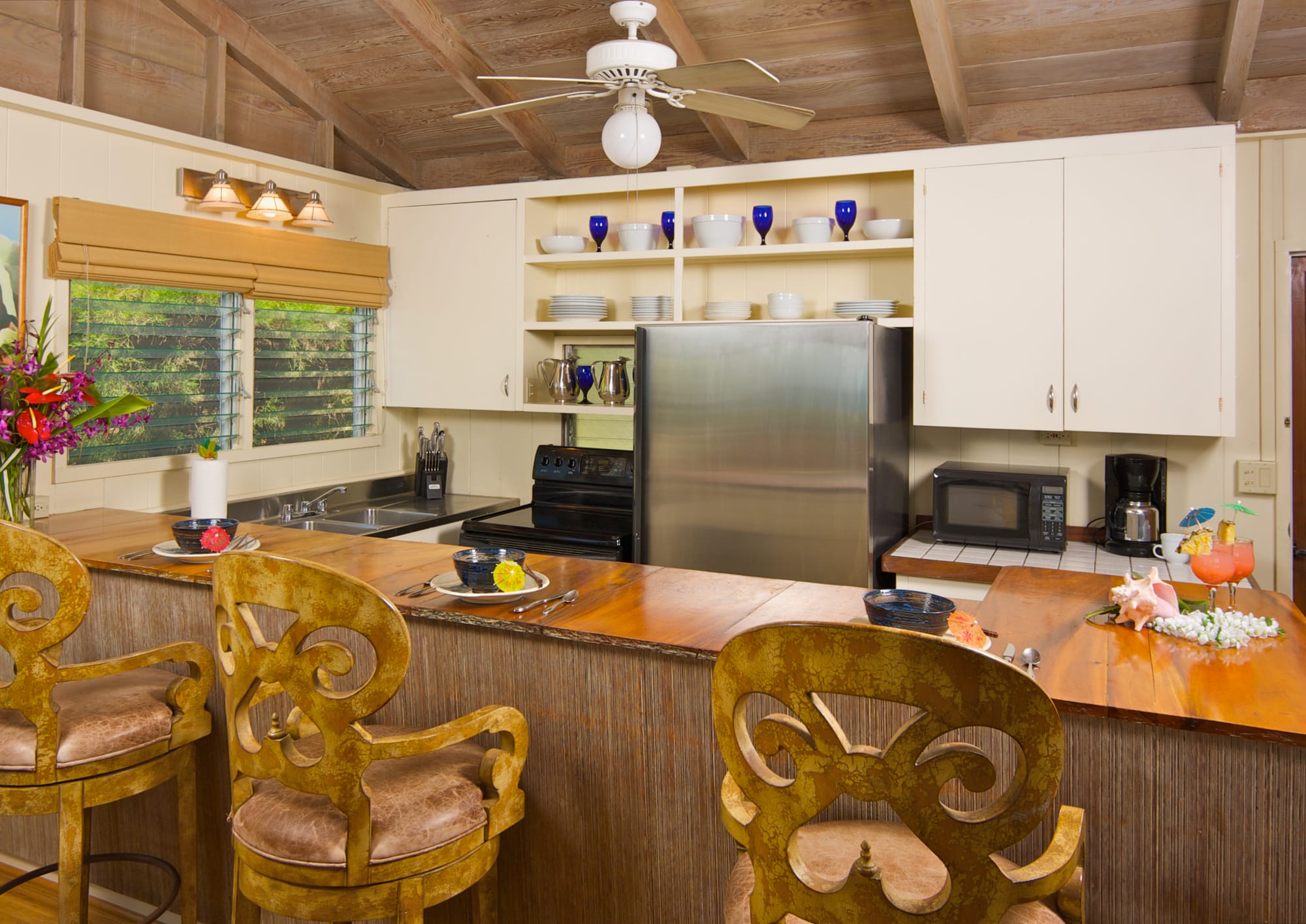
1. Take cabinetry to the ceiling, and finish the top like real architecture
The fastest way to make even expensive cabinets look “furniture placed in a room” is leaving a random gap above the uppers. A built in kitchen usually brings cabinetry all the way to the ceiling, then finishes that last transition with a deliberate detail. That could be crown molding, a small frieze, a soffit design, or a combination that matches the home’s existing trim language.
Going to the ceiling is not only about storage. It is about scale. Upper cabinets that stop short can make the room feel shorter and the cabinets feel undersized. When cabinetry meets the ceiling with an intentional reveal or molding stack, your eye reads it the way it reads a built in bookcase wall.
- Choose a top treatment on purpose. Options include stacked crown, simple crown with a scribe, a flat trim band, or a small built up header that matches other millwork in the home.
- Plan for ceiling reality. Few ceilings are perfectly level. Built in results come from scribing, shimming, and designing moldings with enough depth to hide slight out of level conditions.
- Avoid tiny “dust collector” gaps. If you cannot reach the ceiling, consider a clean, intentional soffit design, not a small inconsistent void.
- Mind door proportions on tall uppers. If the cabinets become very tall, consider two door configurations, or a stacked upper door look, so the doors still feel balanced.
Common miss: adding a short strip of molding that is too small for the room or too thin to hide ceiling variation. Built in kitchens treat the top like a finish carpentry problem, not a trim purchase at the end.
2. Use full height finished end panels and back panels, not exposed cabinet sides
A built in look depends on what you see from the room, not only what you see straight on. Exposed cabinet sides and refrigerator boxes are common places where a kitchen stops feeling custom. A full height finished end panel, properly sized and aligned, makes cabinetry read like a continuous millwork elevation, especially on islands, tall pantry runs, or any cabinet that ends in open space.
End panels can be simple slab panels, applied panels that echo door style, or true furniture style ends with legs and frame details. The key for built in character is that these panels look intentional, meet the floor cleanly, and align with adjacent doors and reveals.
- Specify full height panels where they will be visible. This includes the side of a tall pantry, the end of an island, the exposed edge of a peninsula, and around a refrigerator enclosure.
- Match panel thickness to the desired style. A thicker panel can look more architectural and can allow deeper reveals that mimic traditional millwork.
- Carry door and drawer lines onto panels when appropriate. Applied molding or a framed end panel that aligns with adjacent rails and stiles is a strong built in cue.
- Finish the panel at the floor. Decide whether the toe kick is recessed behind the panel, wrapped around it, or detailed with a furniture base.
Common miss: specifying a finished “skin” that is thin, slightly proud, and does not align with door faces. A built in panel should look like part of the cabinet design, not a sticker applied later.
3. Plan clean, consistent reveals and door overlays across the whole kitchen
Reveal consistency is one of those details people notice without knowing why. The shadow lines between doors, drawer fronts, and face frames create the rhythm of the kitchen. If those lines vary from area to area, the room can feel busy and less refined. Built in cabinetry has a calm, consistent geometry.
Whether you choose inset, full overlay, or partial overlay doors, the goal is to keep the reveals deliberate and repeatable. Inset can look especially built in because the doors sit flush inside a frame, similar to classic millwork. Full overlay can also look built in when the design uses consistent gaps and the cabinets are detailed with panels, valances, and moldings that integrate them into the room.
- Decide early: inset or overlay. Inset requires tighter fabrication and installation tolerances, but it can deliver a very architectural built in feel.
- Set a reveal standard. Many inset kitchens target a consistent small reveal around doors and drawers. The specific dimension varies by maker and style, but consistency is the priority.
- Align horizontal lines. Try to keep drawer top lines, rail lines, and appliance panel breaks aligned across a run so your eye reads one continuous elevation.
- Use fillers strategically. Fillers are not a compromise when planned. They are the tool that keeps reveals and overlays consistent at walls and corners.
Common miss: mixing random overlays, or allowing a small cabinet size change to shift all the lines. Built in kitchens do not look “modular.” They look composed.
4. Treat fillers as design elements, not leftover gaps
Nearly every kitchen needs fillers. Walls are rarely perfectly straight, corners are not always square, and doors and drawers need clearance to open. The built in difference is how fillers are planned and executed. When a filler is an awkward strip shoved in at the end, it announces itself. When it is sized intentionally, aligned with the rest of the cabinetry, and finished like part of the millwork, the kitchen reads seamless.
Fillers can also solve bigger design goals, such as centering a sink under a window, creating symmetry on a focal wall, or providing clearance for appliance handles. In higher end work, it is common to use wider fillers so that cabinets land in better positions, rather than forcing odd cabinet sizes that break the elevation lines.
- Use fillers to center key elements. A sink base centered under a window, or a range centered between tall elements, often needs filler on one or both sides.
- Make fillers wide enough to look intentional. A very thin sliver draws attention. A properly sized filler can read like a pilaster or a trim band.
- Finish fillers like the cabinets. Match paint sheen and color, or match stain and grain direction. If you use applied molding on doors, consider carrying that visual language to visible fillers.
- Integrate fillers with scribe where needed. At walls, a scribe allows the visible edge to remain straight while the hidden edge follows the wall’s irregularities.
Common miss: skipping fillers in design software and letting the installer “figure it out.” Built in kitchens are designed with filler strategy from the start.
5. Use scribed panels, scribes, and proper installation tolerance management
Even the best cabinet shop cannot build a cabinet that perfectly matches an imperfect wall without an installation strategy. Built in millwork is defined by the way it meets the building. That is where scribing comes in. Scribing is the process of fitting the cabinet, panel, or molding to the exact contour of a wall, ceiling, or floor so the final joint looks tight and intentional.
If you have ever seen a kitchen where the caulk line at the wall gets thick and wavy, that is usually a sign that the cabinets were not designed with enough scribe material or the installation did not prioritize scribed fits. A clean scribe detail makes the cabinetry look like it belongs to the house, not like it is covering up the house.
- Include scribe allowance in the design. Panels and fillers near walls often need extra width so they can be trimmed to fit without making the visible face line crooked.
- Specify where you want tight joints versus shadow reveals. Some styles want a hairline fit to drywall. Others prefer a small shadow line with a consistent reveal.
- Do not rely on caulk as the primary “fit.” Caulk is a finishing material, not a substitute for proper fitting.
- Plan for floors too. Large formats, old hardwood, and out of level slabs require shimming, scribing, or both so door gaps remain consistent.
Common miss: ordering cabinets to exact wall to wall dimensions with no scribe room. Another miss is trying to hide a bad fit with oversized trim that looks tacked on. Built in work fits, then trims.
6. Design the toe kick and base treatment as a continuous, intentional “plinth”
The base of the cabinetry is a major visual line, especially in open kitchens where you see long runs from across the room. A built in kitchen has a toe kick that looks straight, consistent, and integrated. If one section has a taller toe kick, or the recess depth changes, or the material shifts, the kitchen can look pieced together.
Many high end kitchens treat the base like a furniture plinth that the cabinets sit on. That does not require literal furniture feet in every case. It can be a consistent recessed toe kick with a clean toe skin, or a flush base with a deeper shadow line, or a furniture base at an island paired with a simpler base on perimeter runs.
- Keep toe kick height consistent. Even small changes can be noticeable in a long run.
- Decide on toe kick depth. A deeper recess can feel more modern. A shallower recess can feel more traditional and furniture like.
- Wrap islands thoughtfully. Consider a finished toe kick on the back and sides of islands and peninsulas, not only on the working side.
- Use end panel returns. Where a run ends, the toe kick should terminate cleanly, often by returning to the wall or dying into an end panel.
Common miss: mixing base details, or leaving raw, unfinished toe kick areas visible from seating or adjacent rooms. Built in kitchens look finished from every angle you can see.
7. Make appliances disappear with panels, trim, and purpose built enclosures
Appliances are often the biggest obstacle to a built in look. A run of cabinetry interrupted by a freestanding refrigerator, a dishwasher with a mismatched finish, or a range hood that feels undersized can prevent the kitchen from reading as a cohesive millwork installation. Custom cabinetry solves this by treating appliances as integrated components, not interruptions.
There are different levels of integration. Fully integrated appliances disappear behind cabinet panels. Semi integrated appliances are still visible, but are framed by purposeful trim panels and cabinets that align to their edges so the whole wall reads clean. Even when you want stainless to show, you can make stainless look built in by controlling the surrounding lines and adding the right side panels and clearances.
- Panel ready refrigeration is a built in cornerstone. When the homeowner’s budget and priorities allow, a panel ready refrigerator is one of the most impactful choices.
- Build a real refrigerator enclosure. Side panels and a top panel or header can make a refrigerator feel like it is part of the cabinet wall.
- Use a dishwasher panel when possible. A panel ready dishwasher keeps the base run visually continuous.
- Design the hood as millwork. A hood surround that matches cabinet finish, or a plaster hood integrated with cabinet heights, looks far more built in than a small metal hood floating on a wall.
Common miss: leaving a refrigerator with exposed sides, or failing to align cabinet tops and door breaks around appliances. Built in kitchens make every appliance look placed by design.
8. Build a molding and trim “system” that ties cabinets to the home
Cabinets can be beautifully made and still feel separate if the surrounding trim language does not match the house. Built in kitchens borrow from architectural millwork. That could mean matching baseboard heights, matching casing profiles, repeating a cove detail from existing crown, or designing new trim that complements the home’s era and style.
A trim system also controls transitions. For example, if cabinetry meets a window casing, you need to decide who dies into whom. Should the cabinet end panel return into the casing with a small reveal? Should the casing be extended to align with cabinet faces? These decisions are what separate “installed cabinets” from “built in millwork.”
- Match or complement existing profiles. When a home has strong existing trim, echo it so the kitchen looks original to the house.
- Use light rail molding under uppers. Under cabinet lighting looks more refined when the fixtures are concealed behind a consistent light rail detail.
- Consider valances where appropriate. A valance over a sink or a cooktop wall can reinforce a built in feel, especially in traditional designs.
- Handle transitions intentionally. At windows, doors, and open shelves, decide on clear reveals, termination points, and whether trim wraps or dies into adjacent elements.
Common miss: selecting crown, light rail, and base molding as separate items with unrelated profiles. Built in kitchens use a family of trim details that feels like one system.
9. Favor symmetry, intentional focal points, and “composed” elevations
Built in design is as much about composition as it is about construction. When people say a kitchen looks “designer,” they often mean the elevation feels balanced. That balance can be symmetrical or intentionally asymmetrical, but it should never feel accidental.
Stock cabinet layouts often chase minimum cost and quick fit. Custom cabinetry gives you the freedom to compose the wall like a piece of architecture. That includes aligning cabinet groupings, using matching widths on either side of a range, centering a hood on a feature wall, or building a pantry wall that reads like a single built in unit rather than multiple boxes.
- Create a primary focal wall. Common focal points are the range wall, a sink under a window, or a tall refrigeration and pantry wall.
- Use pairs and repeating widths. Repeated cabinet widths can create calm rhythm and make the kitchen feel planned.
- Align important verticals. End panels, tall cabinet edges, and appliance edges should stack visually from floor to ceiling when possible.
- Put negative space where it makes sense. Open shelving, glass doors, or a coffee niche can look built in when they are framed and aligned, not randomly inserted.
Common miss: having many different cabinet widths and random filler sizes that create a “barcode” look. Built in kitchens look like a composed elevation, not a catalog grid.
10. Upgrade the details people touch, hinges, hardware, interiors, and lighting integration
The built in impression is holistic. Even if the outside looks seamless, the kitchen can feel less custom when doors do not close smoothly, drawers rack under load, or interior storage looks generic. True custom work feels like a complete system, and those touch points matter every day.
Hardware placement also affects the visual read. Consistent knob and pull locations are part of reveal consistency. Lighting integration, especially under cabinet lighting, can enhance the depth of reveals and highlight millwork details at night. Interior choices, such as dovetail drawers or finished drawer boxes, reinforce that the cabinetry is purpose built, not mass produced.
- Choose hinge and drawer systems for longevity. Soft close is now common, but high quality slides and hinges stay aligned, hold weight, and remain quiet longer.
- Standardize hardware placement. Pick a consistent dimension from door edges or rail lines, and keep it consistent across the kitchen.
- Integrate lighting early. Plan under cabinet lighting channels, wire chases, and switch locations before cabinets are built.
- Specify interiors that match the level of the exterior. Options include finished plywood interiors, upgraded drawer boxes, integrated utensil and spice storage, and trash pullouts sized to your actual bins.
Common miss: beautiful doors paired with builder grade hardware and random pull placement. Built in kitchens feel refined in the hand, not just in photos.
Putting it all together, a practical built in planning checklist
If you want your kitchen to look truly built in, the best results come from treating these design choices as a coordinated set rather than isolated upgrades. Here is a quick way to sanity check your plan before fabrication begins.
- Ceiling strategy: Are uppers going to the ceiling, and is the top detail designed to handle out of level conditions?
- Panel strategy: Are exposed ends fully finished, full height, and aligned with door faces and reveals?
- Reveal strategy: Are inset or overlay choices consistent, and are horizontal and vertical lines aligned across runs?
- Filler strategy: Are fillers planned in drawings, sized intentionally, and used to center focal elements?
- Scribe strategy: Is there enough scribe allowance at walls, ceilings, and floors to avoid heavy caulk lines?
- Base strategy: Is the toe kick height and depth consistent, and will it be finished on visible sides?
- Appliance strategy: Are refrigerator and dishwasher panels, side panels, and hood details fully designed, not assumed?
- Trim strategy: Do crown, light rail, and other moldings relate to each other and to the home’s existing trim?
- Composition strategy: Does the elevation feel balanced, with a clear focal point and repeated widths where possible?
- Feel strategy: Are hinges, slides, hardware placement, and lighting integration specified at the same level as the exterior design?
Why a full service cabinet maker and architectural millwork shop makes this easier
Many of the choices above live in the overlap between cabinetry and finish carpentry. Built in results depend on understanding both. A cabinet shop focused only on boxes may not prioritize scribing, trim transitions, or whole wall composition. A trim contractor may not control cabinet construction tolerances or door reveal standards. When the same team can build and think through both cabinetry and architectural millwork, the layout decisions, the moldings, and the installation details can work together as one system.
That is why homeowners who want a truly built in kitchen often benefit from working with a shop like Masterpiece Millwork and Cabinetry, where the goal is not just to produce cabinets, but to deliver a finished millwork installation that looks original to the home.
Conclusion: built in is a set of deliberate choices, not a single upgrade
There is no single feature that makes a kitchen look built in. It is the accumulation of choices: cabinetry to the ceiling, purposeful end panels, consistent reveals, well planned fillers, real scribing, continuous toe kicks, integrated appliances, a coherent trim system, composed elevations, and high quality touch points. When those decisions are made early and executed precisely, the result is a kitchen that feels calm, permanent, and architectural.
If you are planning custom kitchen cabinets, use these ten design choices as your roadmap. They will help you ask better questions, prioritize the details that matter, and end up with cabinetry that looks like it was always part of the house.